Orvia — Campaign Visual Identity
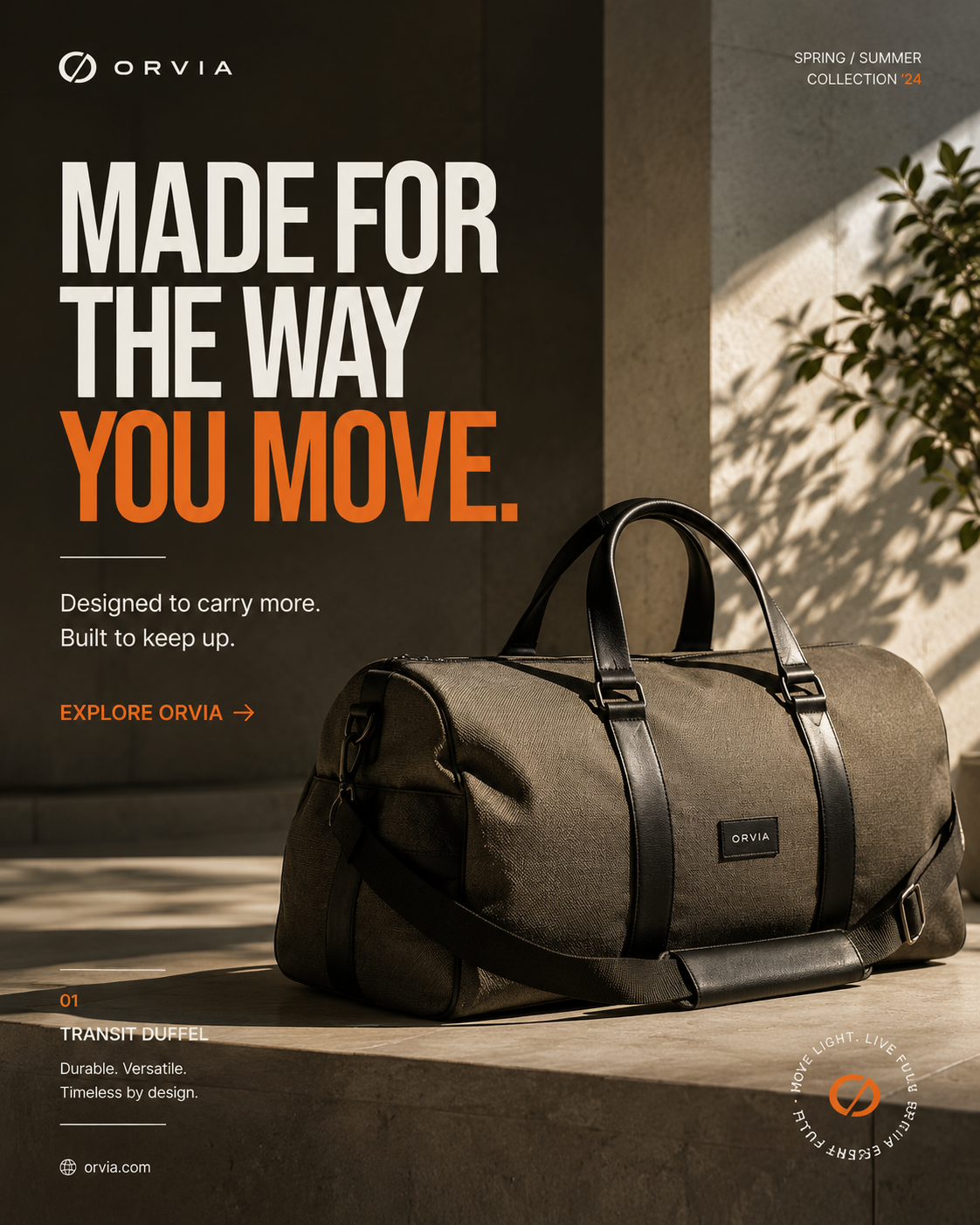
A premium campaign visual designed to combine product presence, movement, and a confident seasonal brand expression.
Brand Overview.
Orvia is presented as a contemporary lifestyle brand with a strong emphasis on movement, durability, and refined everyday design. The campaign system combines product-led imagery, bold editorial typography, warm neutrals, and a controlled orange accent.
Brand Guidelines.
The Orvia campaign system is designed to keep product, message, and brand recognition working together across different promotional formats.
Color Palette.
The Orvia palette balances deep neutrals with warm natural surfaces and a controlled orange accent, creating a premium yet energetic campaign language. The swatches represent the visual direction visible in the supplied artwork.
Brand Typeface.
Orvia uses bold editorial typography to establish campaign recognition, supported by clean utility type for product information, labels, and calls to action.
Brand Logo.
The Orvia identity uses a distinctive circular symbol paired with a clean wordmark. The mark is designed to remain recognizable within campaign compositions while supporting the product-led visual system.
Logo with Grid.
The Orvia logo construction relies on proportion, alignment, and clear space rather than decorative complexity. The supplied artwork is the source of truth for the identity.
Designed to move.
The campaign system brings together product-led composition, a strong headline hierarchy, a warm environment, and a clear action to create a confident seasonal statement.
Made for the way you move.
Let's make something
worth remembering.
Tell us what you're building, what you're trying to solve, and where you want to go.
Start a Graphic Design Project ↗