
Avelor — Brand Identity System
A refined visual identity created to communicate balance, sophistication, and modern living across every brand touchpoint.
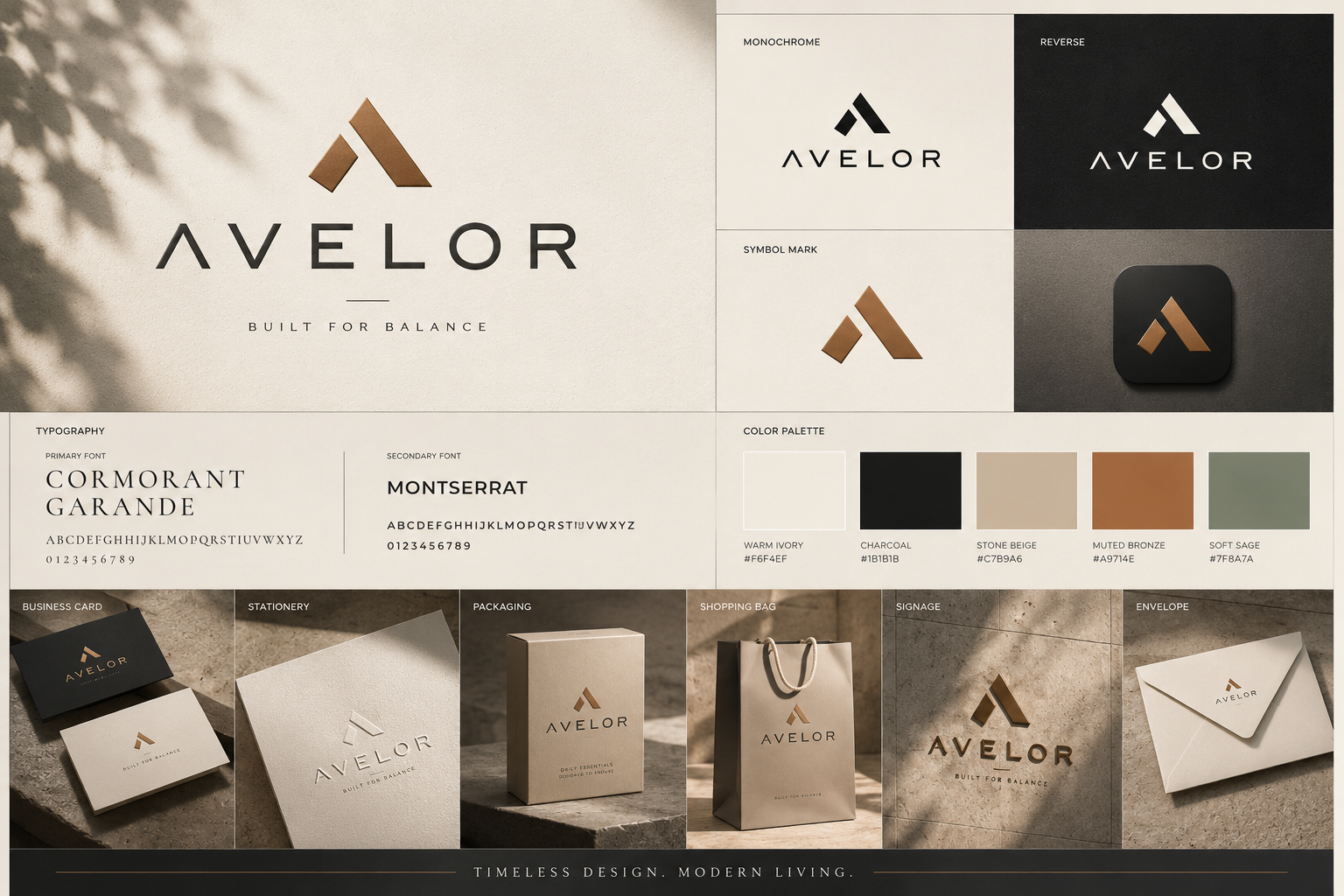
Brand Overview.
Avelor is positioned as a refined lifestyle brand built around balance, simplicity, and considered design. The identity brings together a geometric mark, editorial typography, warm neutrals, and understated applications to create a consistent premium presence.
Brand Guidelines.
The Avelor identity is governed by a small set of principles that keep every brand touchpoint recognizably part of the same system.
Color Palette.
The palette combines warm neutrals with muted earthy accents to create a premium, calm, and timeless visual identity. These values describe the project presentation and do not alter the source artwork.
Brand Typeface.
Avelor pairs an editorial serif with a practical sans-serif to create contrast between premium brand expression and everyday information.
Brand Logo.
The Avelor logo combines a distinctive geometric symbol with a refined wordmark. The relationship is designed to feel balanced, stable, and recognizable across both premium applications and smaller brand placements.
Logo with Grid.
The logo construction is based on controlled geometry, proportion, and alignment. No unsupported measurements are introduced; the supplied artwork remains the source of truth.
Built for every touchpoint.
Avelor extends beyond the logo into a complete visual language. The supplied identity board demonstrates how the system travels across physical and brand-facing touchpoints without losing its restrained character.
Designed for balance.
Let's make something
worth remembering.
Tell us what you're building, what you're trying to solve, and where you want to go.
Start a Graphic Design Project ↗